Client
Trenniq
Services Used
Brand Identity, Logo Design, Brand Patterns, Brand Applications
Year
2024
Disciplines
Trenniq needed a new identity: a mark with more energy, and a system that could stretch from a business card to packaging without losing itself.
What We Built
Logo and mark
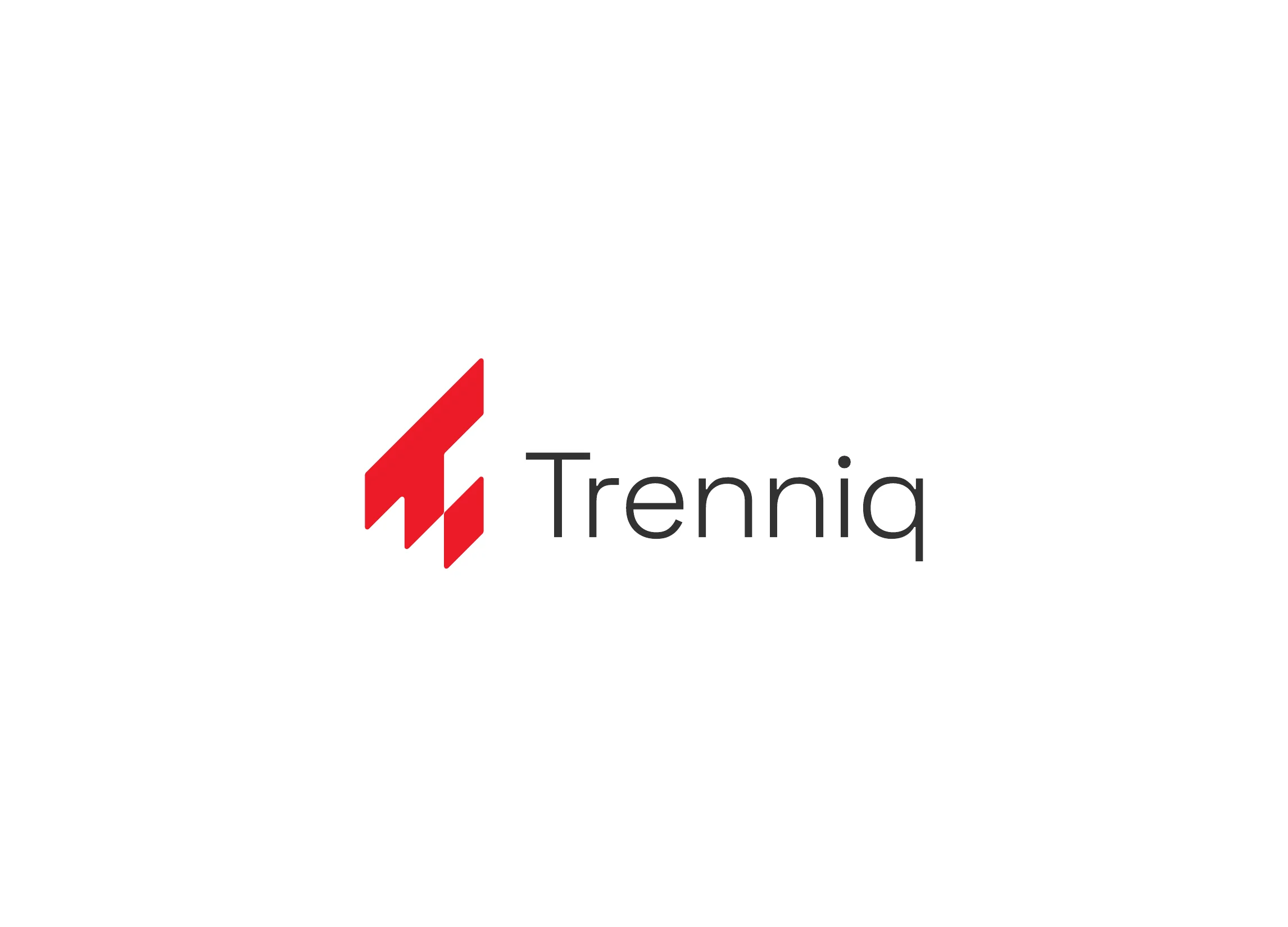
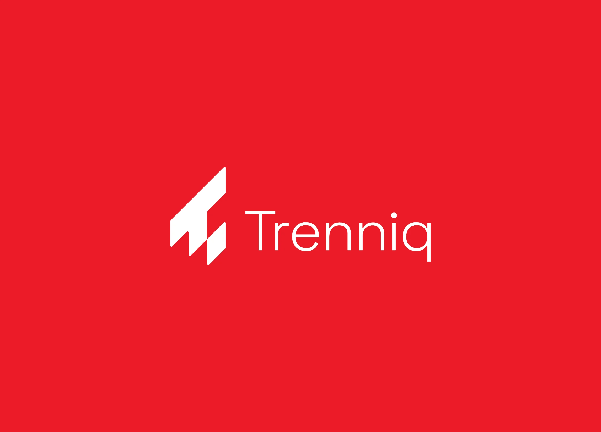
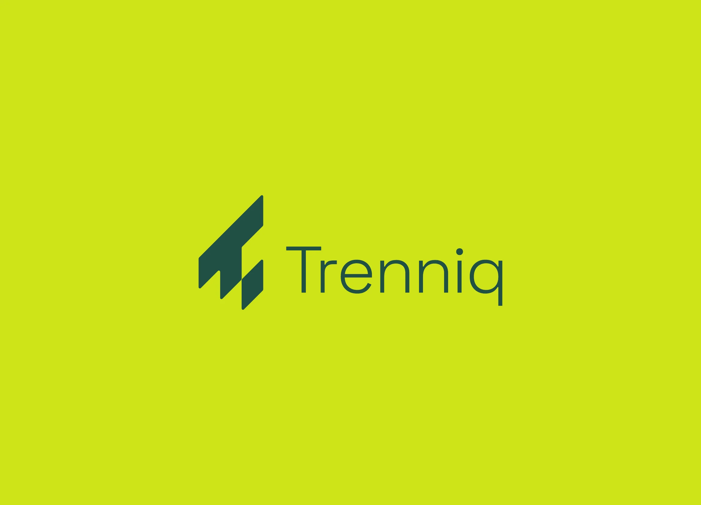
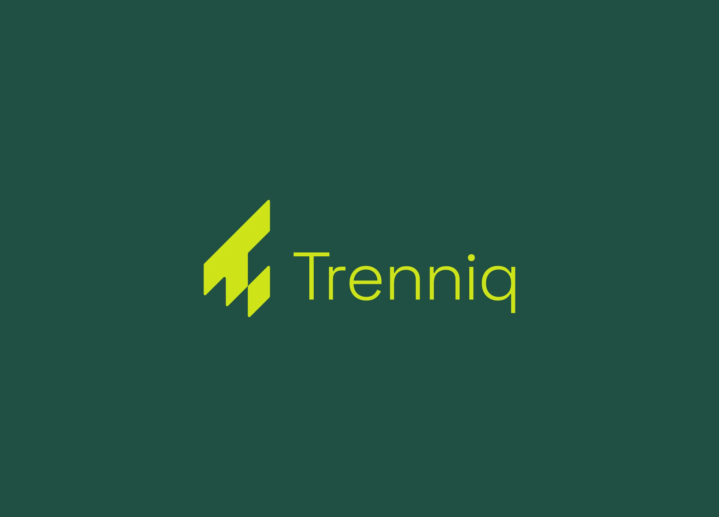
An angular T built from stepped blocks, paired with a light, open wordmark, shown in red, white, black and on the lime and green secondaries.
Colour system
Red #ED1C27, charcoal #333635 and black as the core, with lime, green and deep green as secondaries.
Brand pattern
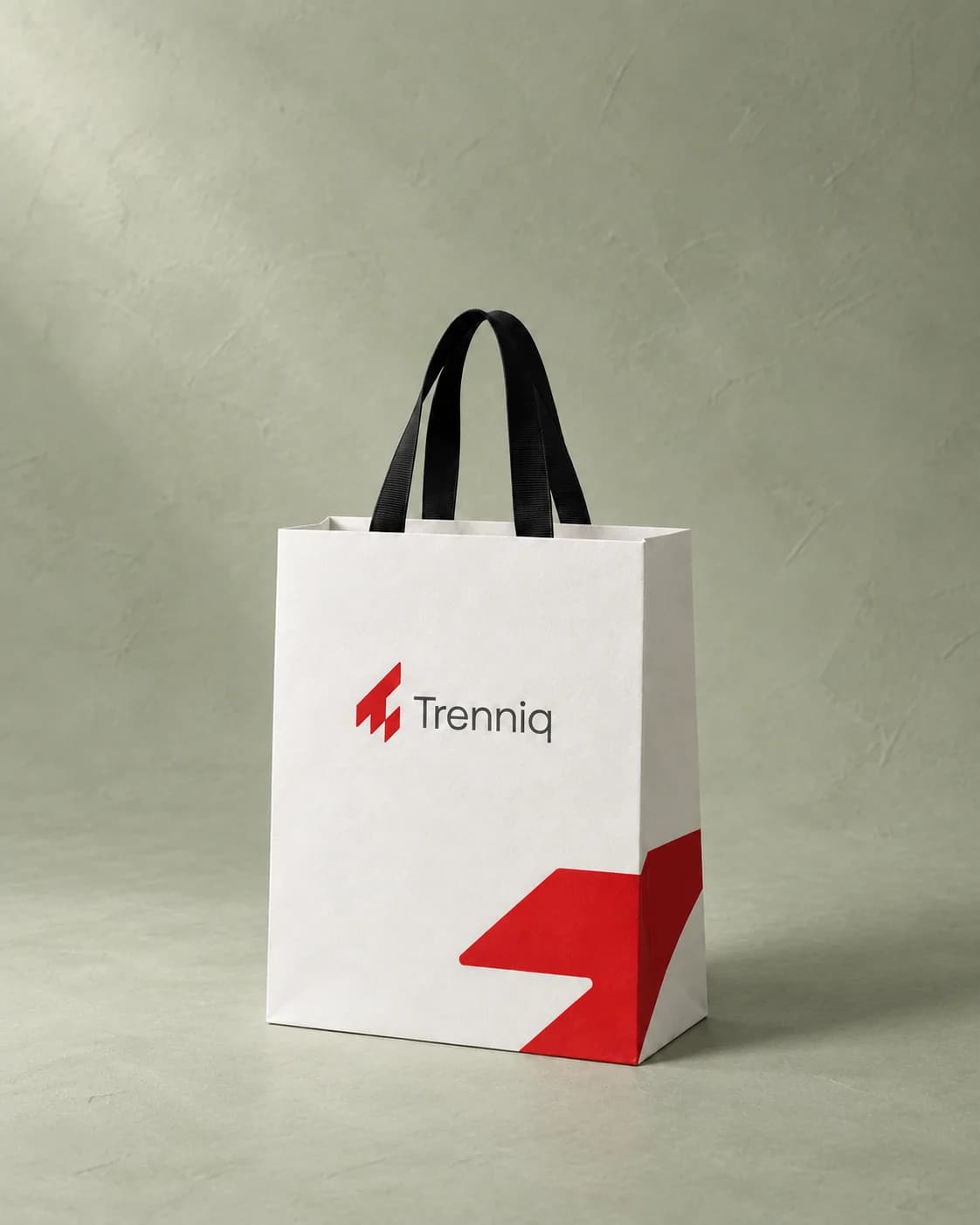
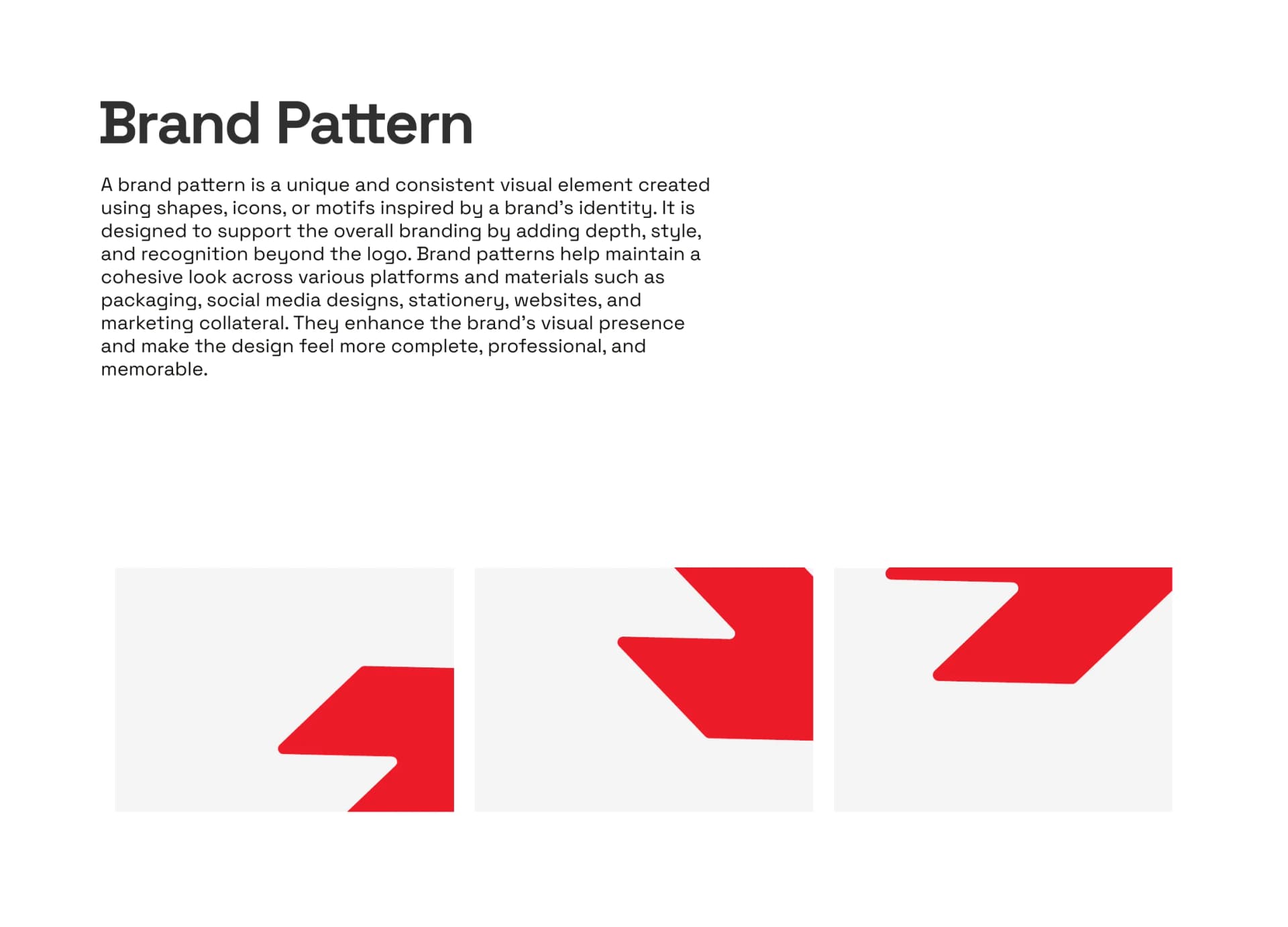
Large angled shapes cut straight from the mark, used to bleed off the edge of stationery and packaging.
Brand applications
Business cards and a shopping bag, showing the mark and the pattern working together in print.
Trenniq now has a sharper, more energetic identity with a clear system behind it: one mark, one palette and one pattern that hold together across every application.

Let's Work Together