Ossarn
An identity for a practice that makes spatial decisions clear
Ossarn is the architecture-practice brand inside a website template we built and sell. We made the identity: the mark, the palette, the type and every application, through to production files.
Client
Zootric
Services Used
Brand Identity, Logo Design, Brand Guidelines, Print Design, Digital Assets
Year
2026
Disciplines
An architecture practice is judged on restraint, and restraint is the hardest thing to fake. A loud palette or a clever mark reads as a template at once, which is exactly what the buyer is trying not to look like. The demo brand still has to hold up on its own, and be easy to replace with theirs.
What We Built
Two squares, one decision
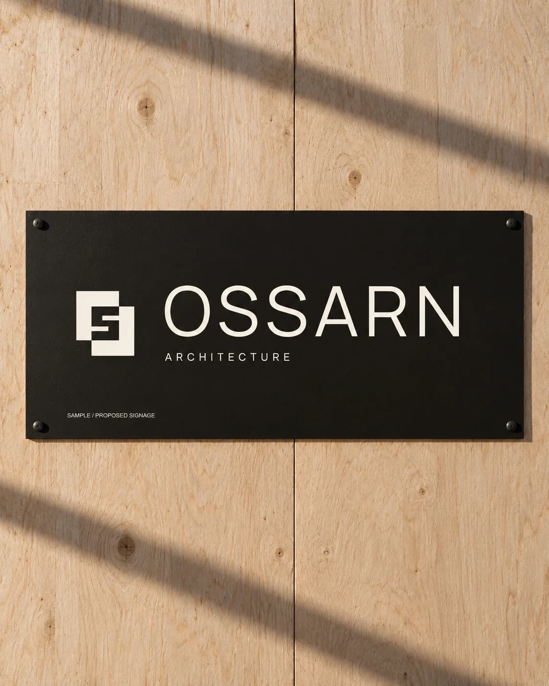
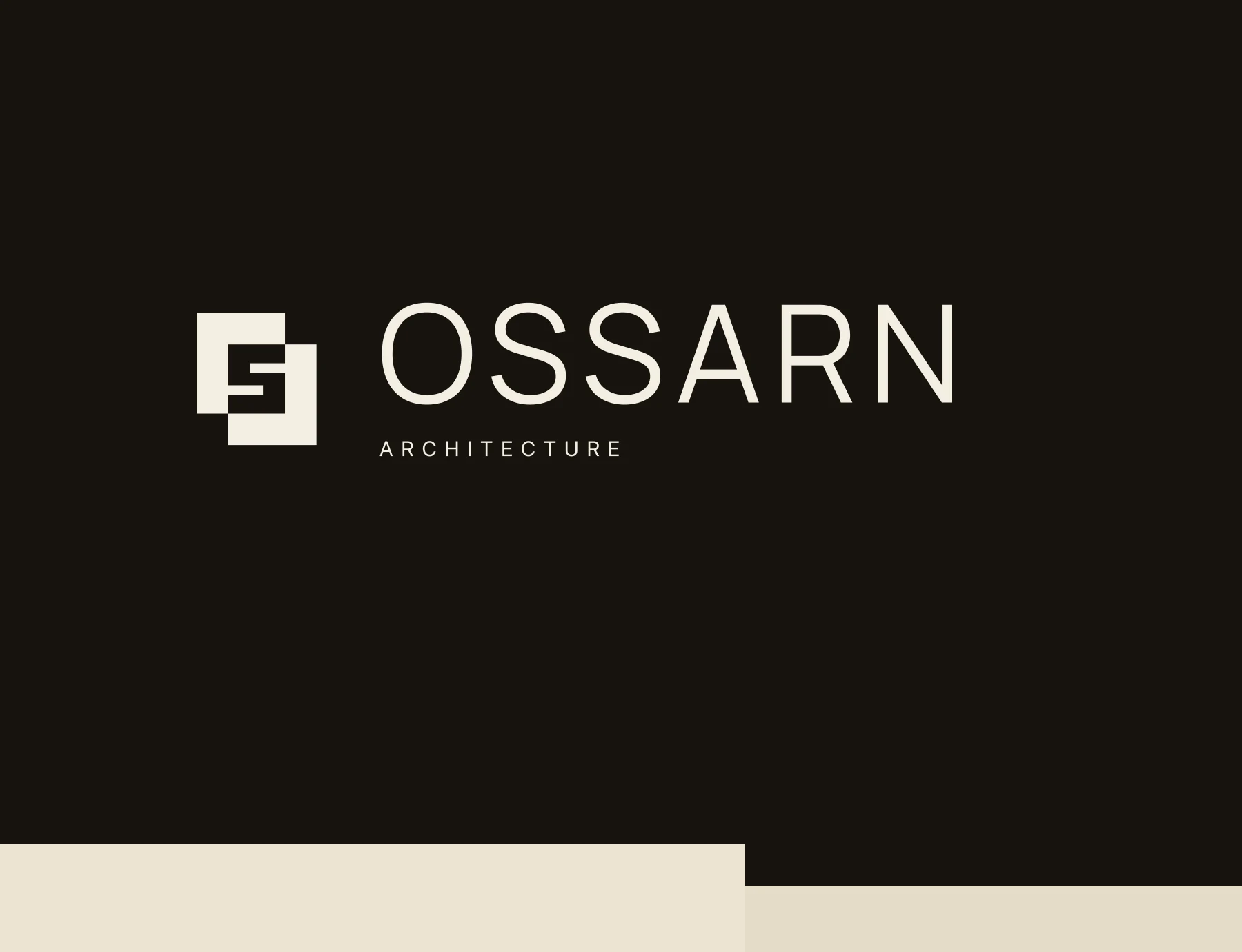
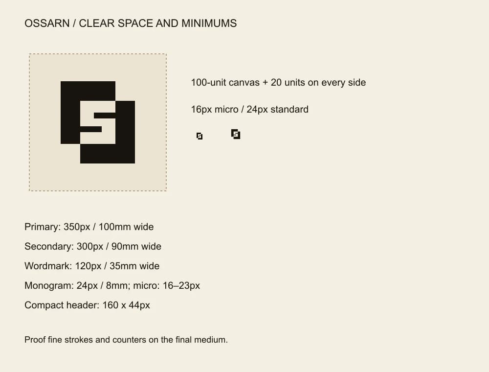
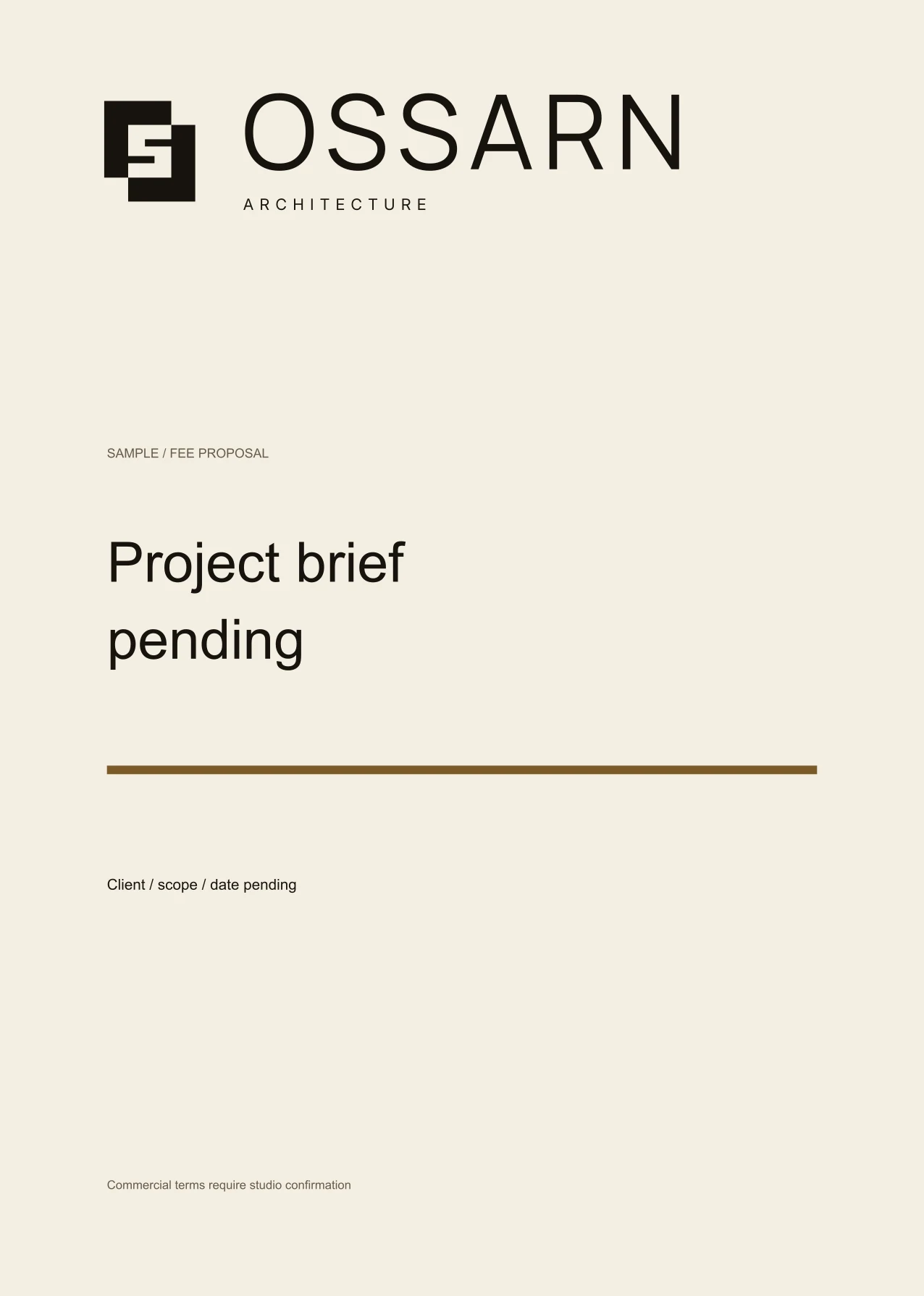
Two solid squares offset from each other with an S cut from the overlap: solid form and open space in one mark.
Colour and type
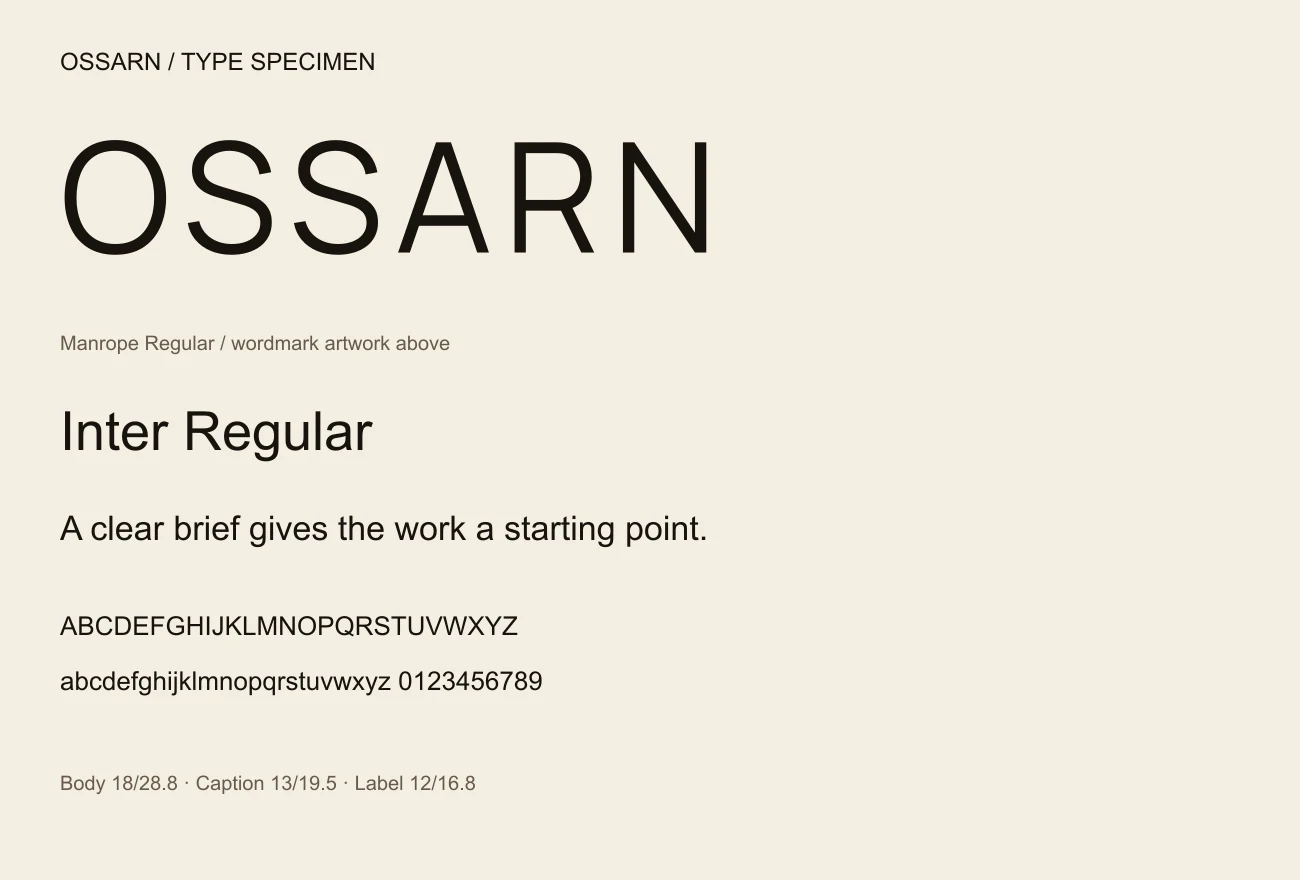
Ink, paper, sand and bronze, taken from the materials the work is made of, with the wordmark in Manrope and everything read in Inter.
A drawing is a brand surface
A drawing title block, a site hoarding and a portfolio spread, because a practice's identity lives on sheets and fences as much as on cards.
Production
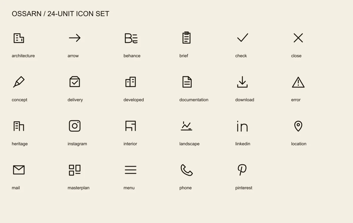
A 14-page guideline, six logo roles in vector and PNG, 23 icons, stationery, merchandise, event artwork, social templates, a deck and tokens.
Live on the template at ossarn.vercel.app, and in the store both ways: the site, the identity, or the two together. Every name, address and project in the demo is placeholder content, replaced on handover.
Let's Work Together