Handlark
An identity for software that keeps work moving
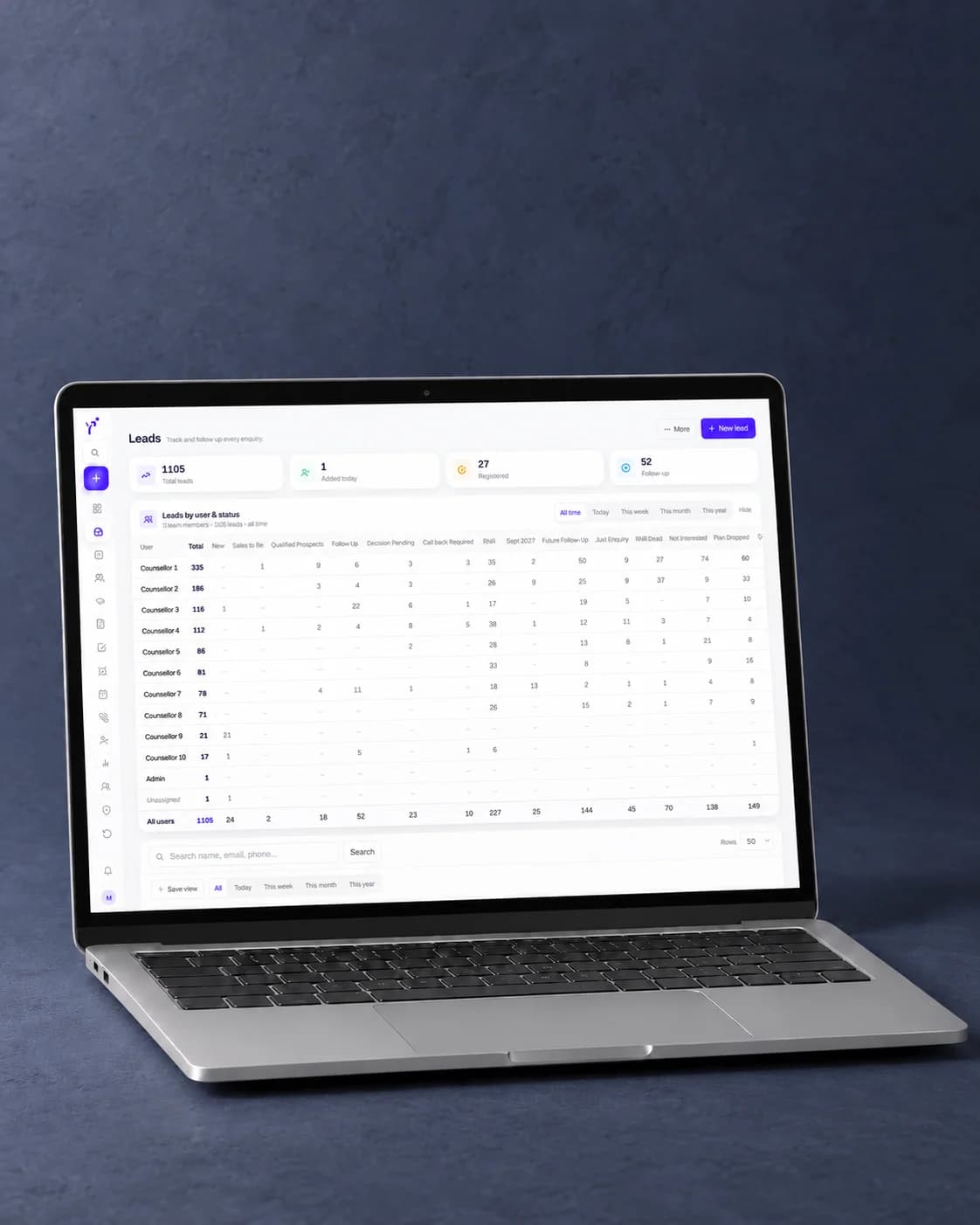
Handlark is an operations tool for small service businesses — the run from enquiry to customer, quote, booked job, invoice and follow-up. We built the product and its brand: the lark mark, the type, the colour, and every application the product and the company need.
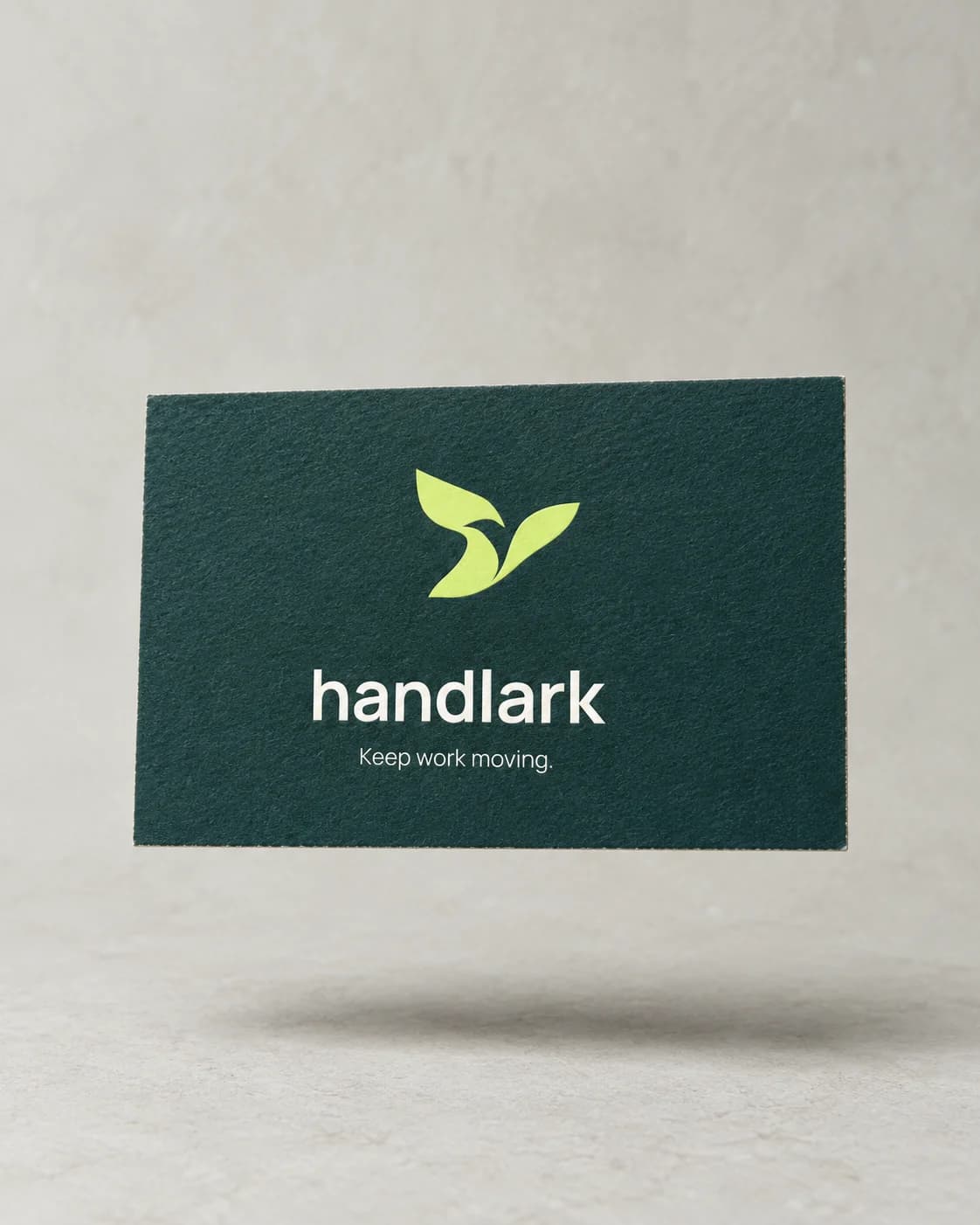
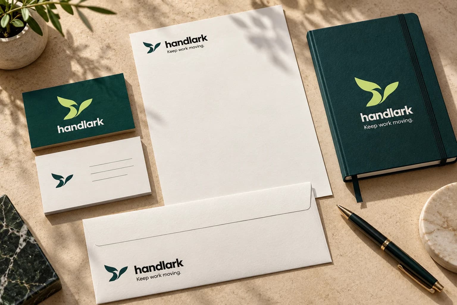
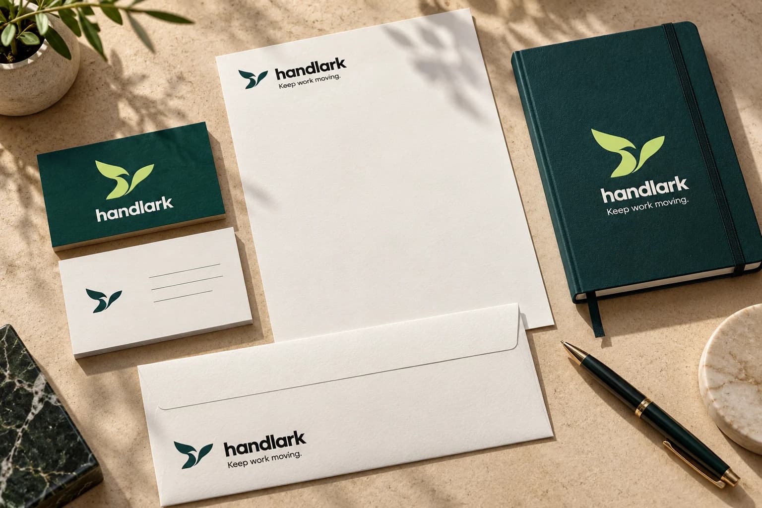
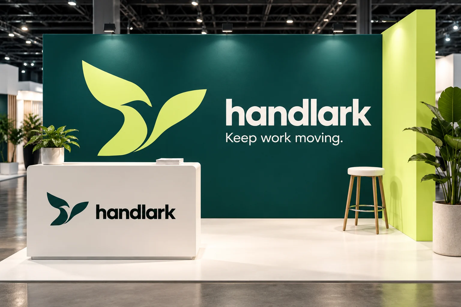
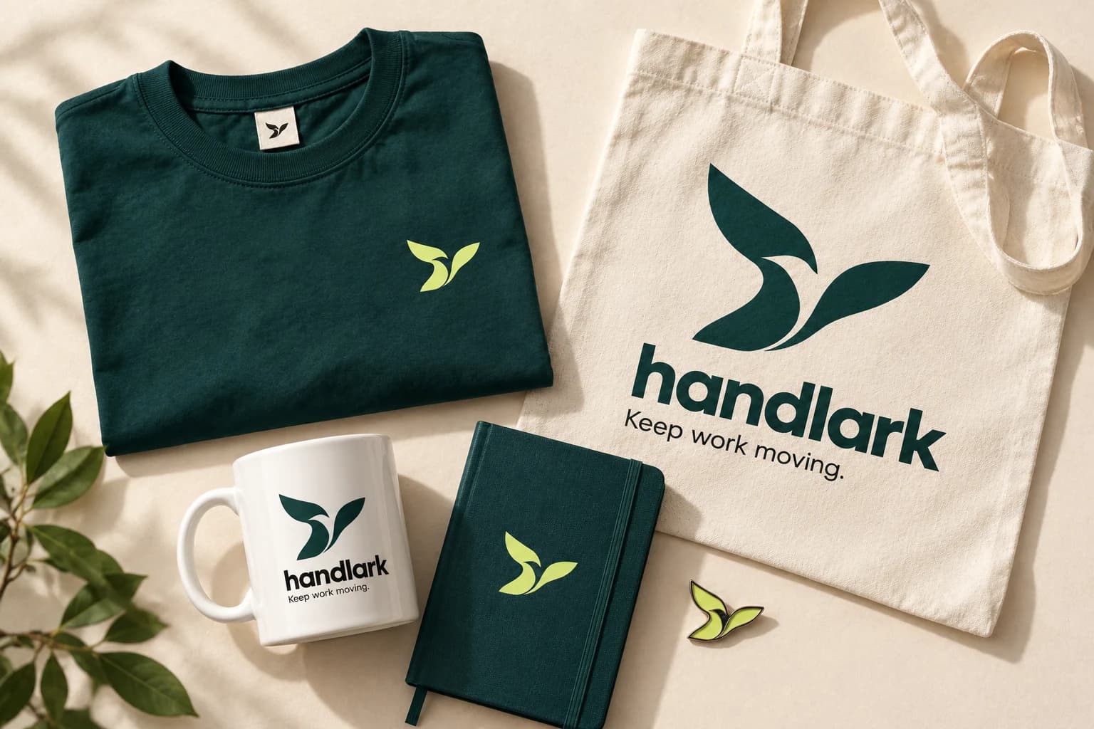
Software for tradespeople and small service teams nearly always looks like software: grids, gradients and a logo that could belong to any of a hundred tools. The brief was an identity with a living thing at the centre of it, warm enough for a one-person business and disciplined enough to hold a dense interface. Two earlier routes were taken to review and rejected — an ascending H, and a folded-link mark — because both described a mechanism rather than movement.
What We Built
The lark
Two sweeping wing forms around an open counter, legible from a 3-metre backwall down to a 16px favicon.
Colour and type
Ink, petrol and lime on paper, set in Manrope 400/600/700 with Source Serif 4 for short editorial accents.
Applications
Stationery, business cards, a conference backwall, rollup and counter, merchandise, social templates and digital assets.
Design system
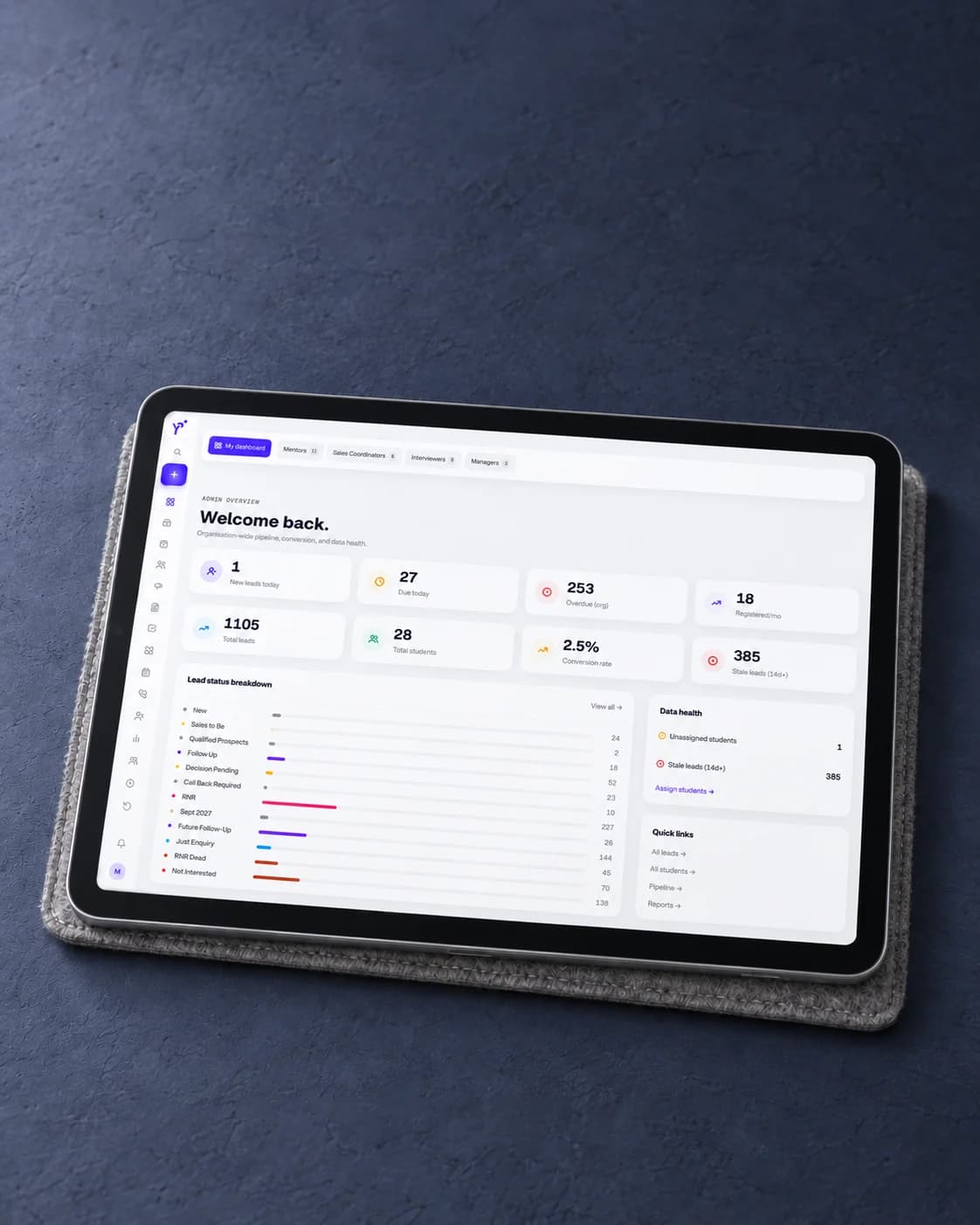
Seven module icons for the product, with brand.css and tokens.json so the interface and the brand cannot drift apart.
Handlark is live, on an identity delivered as 153 files: print with supplier notes, a design system of tokens and module icons so the interface and the brand cannot drift apart, and a file inventory with SHA-256 checksums.
Let's Work Together