Gradibu
An identity for the moment an offer arrives
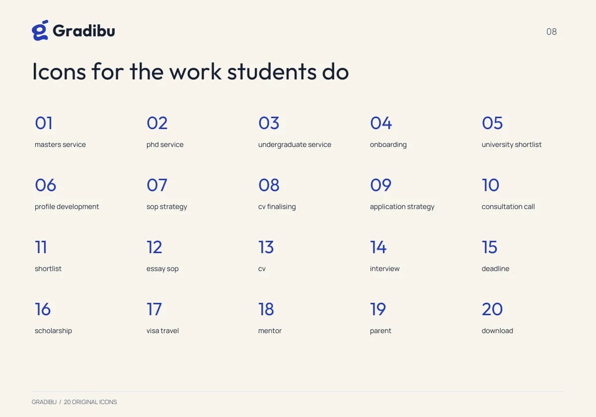
Gradibu is the admissions-mentorship brand inside a website template we built and sell. We made the identity: the mark, the palette, the type and every application, through to production files.
Client
Zootric
Services Used
Brand Identity, Logo Design, Brand Guidelines, Print Design, Digital Assets
Year
2026
Disciplines
A template's demo brand is usually filler, and it shows: a wordmark in a stock typeface, two colours, and nothing behind it. But the demo is what a buyer judges the template by, so it has to hold up as an identity in its own right while staying easy to replace with theirs.
What We Built
The lifting g
A custom lowercase g whose terminal detaches and rises, tested down to favicon size and across monochrome.
Colour and type
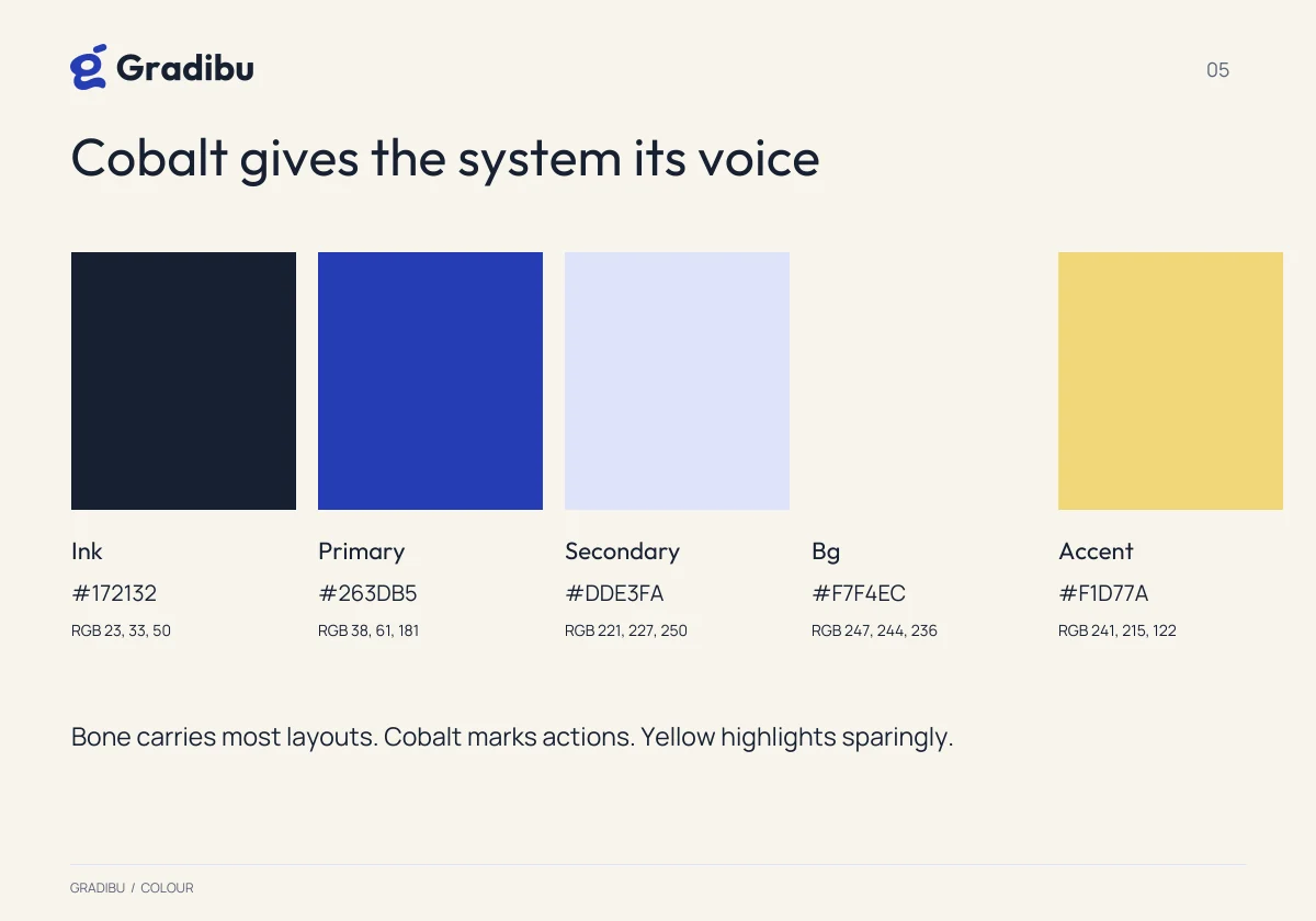
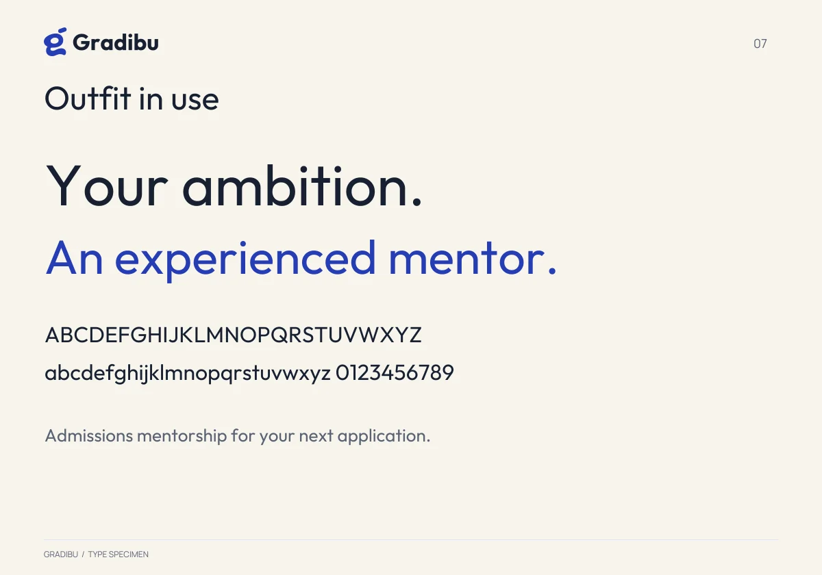
Cobalt on warm bone with ink and a reserved soft gold, set in Outfit over Manrope, with verified contrast pairings.
The offer-letter folder
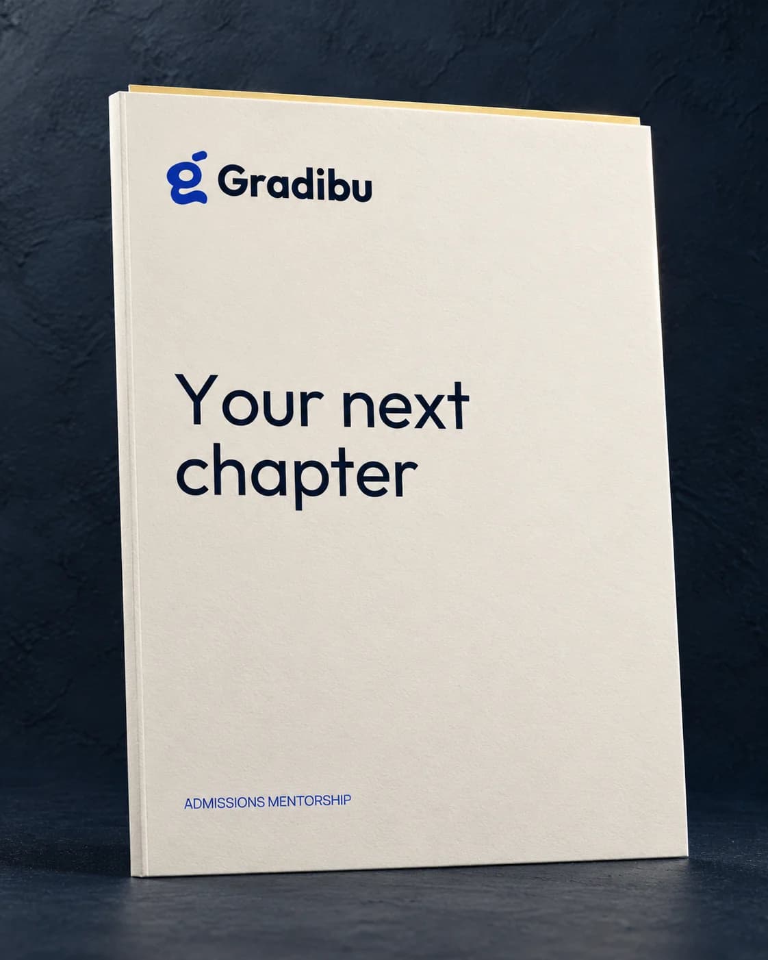
The one piece the brand exists for: what a student is handed when the answer is yes.
Production
A 28-page guideline, a 16-page logo book, SVG and PDF masters, and tokens so the site and the identity cannot drift apart.
Live on the template at gradibu.vercel.app, and in the store both ways: the site, the identity, or the two together. Every name, photograph and figure in the demo is placeholder content and is replaced on handover.
Let's Work Together